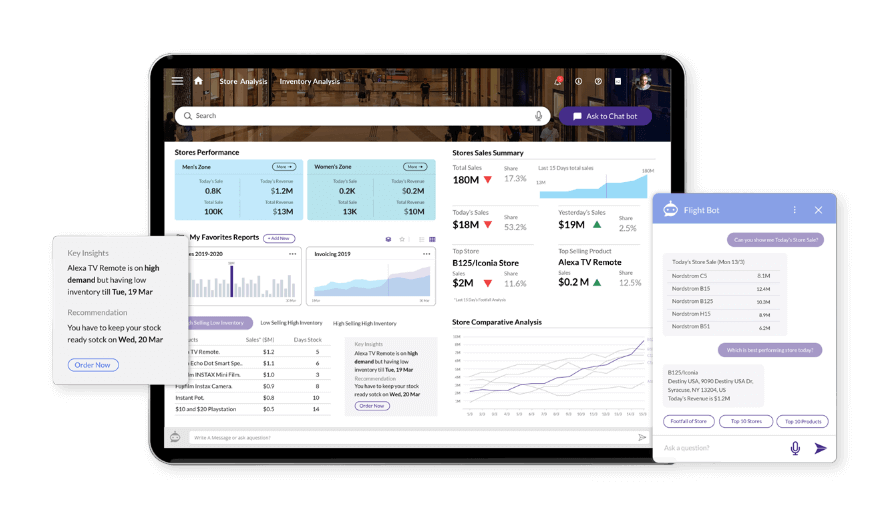
Inconsistent user experiences across data products can lead to poor adoption and unreliable decision-making, hindering your team’s effectiveness. DataHarmony is a comprehensive 12-week program designed to enhance usability, consistency, and discoverability of data insights, empowering your organization to make informed decisions and achieve strategic goals.
The Impact of DataHarmony
- Standardized User Actions – Seamless and intuitive experience across data products.
- Discoverable Insights – Streamlined UI/UX for easy access to crucial information.
- Common Visual Language – Consistent and clear data presentation.
- Behavioral Science Techniques – Personalized user experiences for better engagement.
- Reusable Visualization Assets – Customizable assets that save development time.
- Visualization Best Practices – Data storytelling that accelerates decision-making.
Discover How DataHarmony Can Help
Fill out the form below to connect with one of our experts and learn how DataHarmony can transform your data products and user experience.
Client Stories
Empowering Leadership with Interactive Data Insights
A leading home appliances manufacturer in the US faced significant challenges in communicating data-driven insights to key stakeholders. To address this, our team digitized 23 executive KPIs, transitioning our client from Excel-based reporting to an interactive decision-making platform, reducing manual efforts by 400 hours weekly. Through user-centric design and rapid prototype development, we enhanced the usability and experience, accelerating the development process by 2X and significantly improving end-user satisfaction.
Standardizing Data Products for Improved Decision-Making
A major US retail manufacturer faced challenges with inconsistent user experiences and inadequate insights, leading to a 32% drop-off rate among users and delayed decision-making. To address these issues, our team conducted a comprehensive design assessment, engaging with key stakeholders to identify pain points. We developed a standard Data Product Design Guide and a 60-page Data Visualization Guide tailored to the client’s needs, improving user satisfaction by 2X and reducing development efforts by 26%.


