
A Field Guide to Optimal Fabric Capacity Utilization
Lessons from our Power BI implementation and performance optimization engagements, as a repeatable framework for diagnosing capacity, model, and report issues
Author: Soumya Haridas, Senior Architect, ADM Practice Team
Executive Summary
High Interactive utilization on a shared Fabric capacity, sluggish Power BI report rendering, instability under concurrent user loads making the reports practically unusable for analysis were among the issues faced by a US Specialty Retailer. A single report that could eat up more than 100% of the Capacity was draining costs and scalability of the infra to support their evolving analytics needs. It was tempting to treat this as a capacity problem and simply scale up the SKU. However, the root cause was a combination of several aspects encompassing infrastructure architecture, semantic model design, DAX complexity, and report UI choices etc that placed unnecessary load on the capacity. This is one among the many stories Infocepts helped their customers deal with.
On these grounds, here is the 3-stage framework that Infocepts puts to practice to help our Power BI customers troubleshoot and address these kinds of performance optimization challenges— 1. Diagnose, 2. Identify Areas of Bottleneck, 3. Fix the Bottleneck
How to Diagnose Before You Optimize: The Toolkits
These tools help carry the diagnostic weight. They reveal vital information that take you from “something is slow” to a specific table, measure, or visual to fix.
| Tool | What it helps reveal |
|---|---|
| Fabric Capacity Metrics App | Interactive vs. Background CU utilization values, letting us confirm whether the bottleneck is genuinely capacity-bound or downstream in the model or report. |
| Power BI Performance Analyzer + Fabric Event Monitoring Logs (KQL Tables) | Identify visual rendering time and associated DAX from the query execution logs, helping to narrow down to measures or visual elements that consume execution time and burn CUs. |
| DAX Studio | Storage Engine vs. Formula Engine time and CPU time per query, isolating whether slowness came from the model or the report design, gives clues on expensive visuals and measures, vertipaq analyzer narrows down the heavy model entities. |
| Tabular Editor 3.0 (BPA) | Deviations from modelling best practices via the Best Practice Analyzer, with fixes applied directly through TMDL edits. |
| Measure Killer | Unused measures, columns, and tables inflating the model and slowing refresh. |
We typically start with review of Fabric Capacity Metrics App to analyse if any infrastructure limitations exist. If the customer does not allow third party tools like DAX Studio or Tabular Editor, then the basic Power BI Performance Analyzer in Desktop or Service along with Event Monitoring Logs from the Workspace, helps identify visual and measure bottlenecks. DAX Studio, Tabular Editor and Measure Killer also help bulk fix many issues in automated manner with less manual efforts.
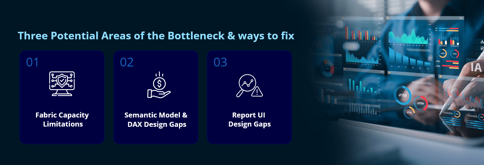
Three Potential Areas of the Bottleneck & ways to fix
In most of our optimization engagements, the performance bottlenecks were found attributed to either Fabric Capacity Limitations or Poor Design of Semantic Model or Poor Design of Report UI. For the US Specialty Retailer, it was a mix of all 3.
Area 1: Fabric Capacity Limitations:
Why review Capacity metrics App first?
In Fabric, user-driven actions such as running a query or loading a report are classified as “Interactive Operations”, while longer-running work such as semantic model refreshes is classified as “Background Operations”. The two are smoothed differently — Interactive operations over a window of minutes, Background operations over a full 24 hours. So, a capacity can look healthy on average while still throttling the exact user-facing interactions that matter most. Hence review the Capacity metrics App first before diagnosing any model or report for changes: It tells you whether you are fighting a true capacity ceiling, or a design problem that merely presents as one.
Microsoft’s own capacity guidance frames the response to sustained high utilization as a choice of three levers: optimize the workload, scale up the SKU, or scale out across capacities. Below are two scenarios we addressed from capacity redesign standpoint for this customer.
| Issue or scenario | Fix Implemented | Impact |
|---|---|---|
| Unhealthy Fabric landscape setup: A single Fabric SKU (F64 in this case) served all prod and non-prod workspaces and was throttled heavily during peak loads. | Dedicated SKU (F64) for production workspaces; isolated non-production workspaces onto a lower-tier SKU (F32). | Production remains stable unimpacted by unpredictable non-prod testing workloads or poor design of non-prod reports. |
| Inadequate Data gateway capacity: The VNet data gateway connecting to the source database was hosted on an undersized F8 server. | Provisioned adequate compute on the gateway host to speed up data transfer. | Reduces gateway queuing delays that were bleeding into Background operations. |
Area 2: Semantic Model & DAX Design Gaps
Many aspects in the Semantic Model design and Measures or DAX Design can impact performance of the report considerably. These can be handled through best practices adherence and design changes.
a. Semantic Model Design & Relationships gaps
Microsoft’s relationship guidance is direct on this point: bi-directional relationships require more processing and can degrade query performance as their number grows, and it recommends minimizing their use in favour of single-direction filtering or DAX functions such as CROSSFILTER where bi-directional behaviour is genuinely required. Here we are few things from semantic model aspects we solved for the customer.
| Issue / Scenario | Fix Implemented | Impact |
|---|---|---|
| Composite models with cross-model interactions: Multiple shared semantic models with cross-model data references drove up XMLA read operations and Background utilization. | Consolidated related tables for a given analysis into a single model; eliminated cross-model dependencies in composite models (e.g., avoid a dimension in one model slicing a fact table in another model). | Lower Background utilization; splitting related tables into their own models also improved refresh time. |
| Bi-directional & many-to-many relationships: Excess bi-directional joins and M:M relations create ambiguity and slows query evaluation. | Reduced bi-directional joins through model redesign; handled M:M relationships with bridge tables or by setting single-direction filtering. | Cleaner, faster, and more predictable filter propagation. |
| Oversized model from tables with large data volumes and undesired columns: A 2.8 GB model with excessive columns drove a 1-hour refresh window. | – Fetch only required columns in the model; – Ensure query folding on all Power Query steps; – Pushed transformation and filter logics to backend views; – Used aggregated views to cut raw data volume. | Helped drop the Model size to 0.7 GB with refresh under 12 minutes (80% improvement in refresh time) Faster refresh, though backend views also abstract away structural changes that could otherwise break the model. |
Point to note: Too much aggregation at report specific grain, also reduces scope for model reusability for other reports.
b. Measure Design & DAX Complexity
Complex, context-filtered DAX evaluated on the fly is one of the most common Formula Engine bottlenecks. Key is to move any repeatable logic out of DAX and push it into the model or the source and let the measure layer stay thin. Few examples from this use case, are as below.
| Issue / Scenario | Fix Implemented | Impact |
|---|---|---|
| Complex Time-based transformation on the fly: Every KPI needed time-based variants (MTD, YTD, QTD, LCW, WTD, L5W) computed on the fly with complex DAX, degrading performance. | Built a backend transformation table storing the applicable date range for each XTD; a single measure reads the time-period slicer selection and computes against that range. | One measure now serves every XTD selection instead of a separate measure per variant. |
| Measure sprawl: The same KPI needed multiple variants — current year, last year, variance, ending/beginning period inventory, and so on. | Used Calculation Groups to compute CY/PY and EOP/BOP variants and hid the redundant underlying KPIs. | Cuts measure counts sharply, though the report UI needed some redesign around Calculation Groups, which also have known limitations with combo charts. |
| Complex measures needing pushdown: Too many on-the-fly, context-filtered calculations for complex KPIs incurred heavy compute at query time. | Pushed base-KPI calculations (CY, PY, EOP, BOP, XTDs) to backend aggregated fact tables, pre-calculated at the reporting grain; added helper measures to simplify the remaining on-the-fly math. | Once base numbers are pre-computed, the remaining complex math resolves noticeably faster. |
| Lack of Model hygiene: Too many objects — KPIs, columns, helper tables — were exposed directly to report and model users. | Hide unnecessary KPIs, columns, and helper tables; labelled remaining objects in business terminology with descriptions and synonyms; organized measures into a measure table with subfolders; grouped data tables by subject area. | Hidden measures no longer incur the compute cost of loading into memory, and the model is easier for other authors to navigate. |
Area 3: Report UI Design Gaps
Even a lean model can be undone by a report page asking for too much at once. Report UI design plays a considerable role in ensuring optimal performance during report interactions. Limiting the visuals per page and measures per visual is key for the design. Microsoft’s own dashboard design guidance calls out Field Parameters specifically to let users bring in measures or data fields on demand rather than loading them all up front.
| Issue / Scenario | Fix Implemented | Impact |
|---|---|---|
| Long page load times: Too many visuals and bookmarks placed on a single page. | Redesigned pages with fewer visuals, multi-KPI visuals in place of several single-KPI ones, limited bookmarks and custom visuals, split content across pages and drill-throughs, and used filter panels to scope data up front. | Faster, more consistent page loads. |
| Long visual render times: Table visuals carried too many measures at once. | Introduced Field Parameters so users add measures on an as-needed basis, with only a few measures loaded at start. | Faster initial render without limiting analytical flexibility. |
Tools like Tabular editor and Measure Killer not only help diagnose these problems but also fix many of them automatically with lesser manual overheads such as remove unnecessary objects from the model, bulk-fix formatting problems, perform DAX refactoring etc.
Overall Outcome: All the above steps have helped lower the interactive utilization levels from 230% down to 50%, bringing almost 4x efficiency in the Fabric Capacity Utilization for this performance optimization engagement with the US Specialty Retailer.
Key Takeaways: Quick-Reference Checklist to scale performance
Capacity & Infrastructure
- Always Review Capacity Metrics App first
- Always Isolate prod / non-prod on separate SKUs
- Size gateway infra for real data volumes adequately
Semantic Model
- Default to single-direction relationships; Reserve bi-directional for genuine M:M bridge scenarios
- Limit cross-model XMLA dependencies
- Ensure Tables Joins are on Numeric columns
- Fetch only required columns. Confirm query folding; push logic to backend views. Ensure Model Hygiene
Measures & DAX
- Centralize time intelligence logic in one table. Avoid separate DAX variant per XTD for each KPI
- Use Calculation Groups to collapse repetitive KPI variants into reusable definition
- Pre-aggregate complex KPIs upstream
Report UI Design
- Cap visuals & bookmarks per page;
- Cap number of KPIs per Visual
- Split dense pages into drill-throughs.
- Use Field Parameters to defer loading
- Profile using DAX Studio or Performance Analyzer before blaming
Closing Thought
The instinct when a Fabric capacity shows high utilization is usually to scale it up. That is sometimes the right call — but in most engagements, the capacity was reporting symptoms of decisions made upstream: a shared SKU carrying non-prod noise, a model with more surface area than the analysis needed, DAX doing on-the-fly work that belonged in the backend, and pages asking for more than users needed at first glance etc. Working through the four layers in order — capacity, model, measures, report — turns a vague performance complaint into a short list of specific, fixable design decisions, and it is a far more durable fix than simply buying more Capacity Units. Are you facing similar issues with Power BI performance and need guidance to solve? Do write to us.
Frequently Asked Questions
Is Your Power BI Capacity Reporting Symptoms Instead of Causes?
Get a diagnosis before you buy more Capacity Units - capacity, semantic model, measures, and report design reviewed in order, with a short list of specific fixes.

Soumya Haridas is a Senior BI Architect (Analytics and Data Management) at Infocepts and has a strong experience in designing and implementing Data & Analytics solutions across industries.
Read Full BioRecent Blogs



Infocepts