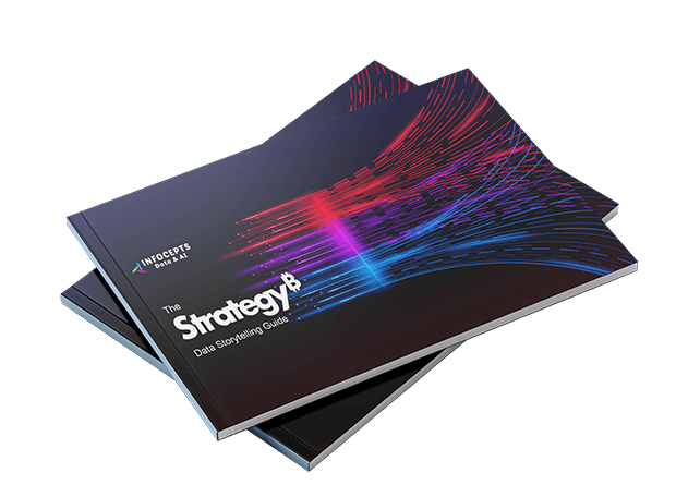
Get Your Guide

In this guide, you will learn:
- How to apply storytelling techniques within Strategy for data-driven decision-making
- Best practices for designing Strategy dashboards that inform, align, and inspire action
- Ways to structure insights with clarity and persuasion.
In a world overflowing with data, successful decision-making depends not just on what the numbers say—but on how clearly they speak. That’s where data storytelling becomes essential.
Whether you’re pitching a business case, tracking KPIs, or aligning teams to common goals, your ability to convey meaning through data can make all the difference. Good storytelling goes beyond charts and visuals. It requires intentional design, structured thinking, and a user-first approach. Without these, even the most data-rich dashboards can become cluttered, overlooked, or misunderstood.
This practical guide from Infocepts shares proven techniques to improve your Strategy dashboards through better storytelling.
What you’ll learn:
- Design layouts and flows that guide users naturally through insights
- Build interactivity that encourages exploration and discovery
- Apply narrative structures that make your data memorable and actionable
- Use design elements—like typography, spacing, and navigation—to improve usability and engagement
Who Should Read This Guide?
- Discover how to move from displaying data to delivering strategic clarity
- Learn how to create Strategy dashboards that do more than report—they influence and inspire
- Equip yourself with storytelling techniques that help users grasp not just the what, but the why behind the numbers
Whether you’re a dashboard designer, business leader, or strategy analyst, this guide will help you create data stories that stick—and dashboards that deliver real results.
Download the guide now to start turning your data into strategic action.
You might also like


