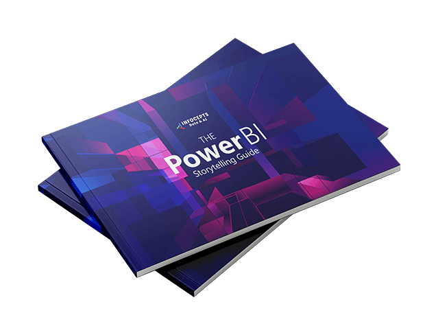
Get Your Guide

In this guide, you will learn:
- Best practices for designing engaging, intuitive Power BI dashboards
- How to turn raw data into compelling, decision-ready stories
- Techniques to boost interactivity, usability, and brand alignment in your reports
Unlock the full potential of your Power BI dashboards with our comprehensive Data Storytelling Guide for Power BI. Whether you’re a business analyst, data designer, or BI developer, this resource is packed with Power BI dashboard design best practices to help you create visually stunning, interactive, and insightful dashboards that drive informed decisions. By following proven techniques and expert-backed design principles, you’ll learn how to transform complex data into compelling, user-friendly stories that resonate with your audience.
What You’ll Learn in This Guide
- Navigation Best Practices – Master intuitive report navigation with clearly defined primary and secondary menus, optimized filter panel styling, and a variety of slicers for a seamless user experience.
- Effective Presentation Techniques – Learn how to structure your reports with consistent typography, layout grids, and branded color palettes. These Power BI design tips improve readability, visual hierarchy, and alignment with your corporate identity.
- Organized and Actionable Content – Discover how to organize data using structured layouts for easy comparison and clarity. Understand different content formats and how to enable smooth data exports for extended analysis.
- Visualizations that Drive Insight – Use the right charts, graphs, and advanced visual elements to maximize insights. Integrate certified visuals to ensure your Power BI reports are reliable, scalable, and effective.
- Interactivity and User Engagement – Take your dashboards to the next level with interactive features like KPI cards, smart narratives, and embedded chatbots. Deliver a self-exploratory experience with real-time insights and storytelling tools.
Who Should Download the Power BI Data Storytelling Guide?
This practical, step-by-step guide is essential for:
- Power BI users aiming to master the art of data storytelling.
- Analysts and report designers seeking to apply dashboard design best practices.
- Teams looking to enhance user experience and data clarity through smart layout and interactivity.
- Business leaders who want dashboards that drive action and strategic decisions.
Download the guide now and start creating data stories that make an impact!
Looking to take your skills further? Explore how our Data Product Design approach helps enterprises build intuitive, scalable, and outcome-driven analytics solutions across tools like Power BI, Tableau, Strategy, Looker and more. Also, explore our Data Visualization use case library for design inspiration.
You might also like


