
Your team has invested in self service BI, but most decisions are still driven by static exports, email snapshots, and weekly meetings. The tools are there, yet business users keep going back to old dashboards that only answer yesterday’s questions.
If this sounds familiar, you don’t have a technology problem as much as a design and adoption problem. Replacing legacy dashboards with decision-ready analytics takes a different way of thinking about questions, data, and how people actually work.
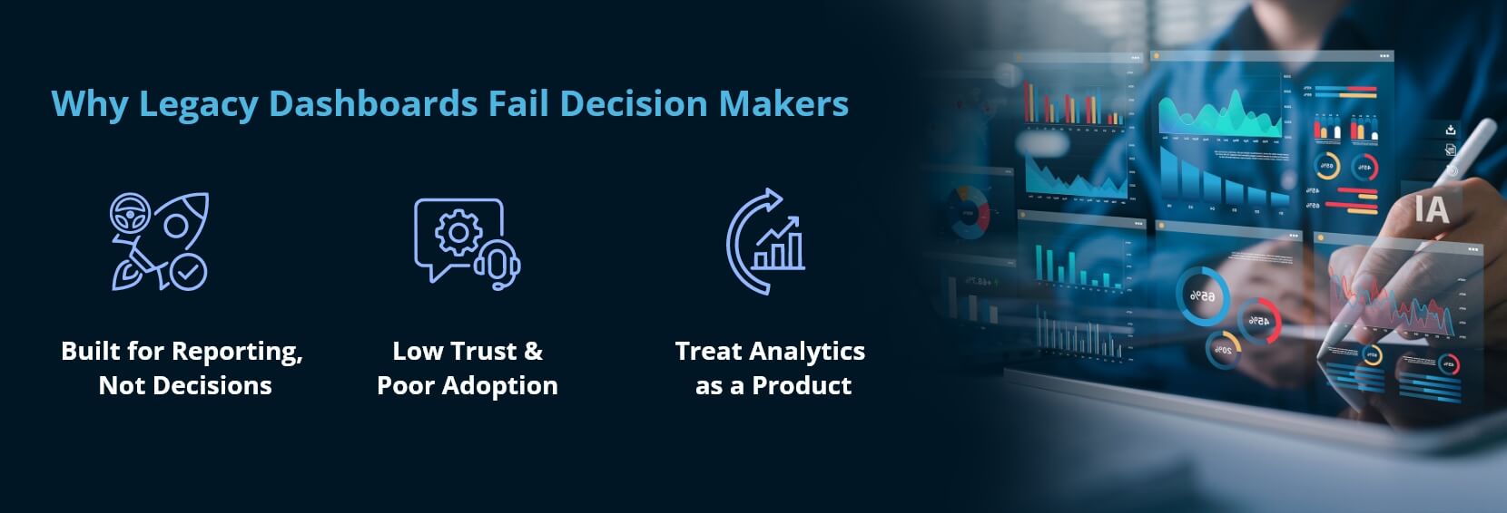
Why Legacy Dashboards Fail Decision Makers
Legacy business intelligence modernization projects often stall because old dashboards were never designed for real-time, front-line decisions. They were built for monthly reporting, not for product owners, marketers, or plant managers who need to react today.
Those dashboards usually share the same issues: too many charts, no clear narrative, and KPIs that don’t map to specific actions. People export to Excel because it’s the only place they feel they can actually test a hypothesis.
On top of that, governance models lag behind. Data definitions differ by department, refresh schedules are unclear, and users don’t trust what they see. So adoption stays low and teams spin up their own shadow reports.
If you want decision-ready analytics, you need to treat your BI front end like a product, not a reporting backlog that IT maintains on request — which is the premise behind data product design.
From Reports To Self Service BI Product Thinking
Successful BI transformation efforts start by reframing dashboards as products with specific users, problems, and outcomes. Self service BI is the experience layer that lets business users explore data confidently without writing SQL or waiting on a developer queue.
That means you don’t just “rebuild the existing reports in a new tool.” You step back and ask: which decisions matter most, and what information has to be on screen to make those decisions faster and more accurate?
A product mindset also forces prioritization. Instead of 120 legacy dashboards, you might end up with 12 decision apps that actually get used, each with a clear owner and a roadmap for improvement.
Defining Decision-Ready Analytics
When teams talk about modern BI, they often mix up data availability with decision readiness. Just because data is technically accessible doesn’t mean a manager can use it in a three-minute hallway conversation about next quarter’s targets.
Decision-ready analytics give a specific role a small set of metrics, context, and recommended next steps that tie directly to their daily choices. They guide the user from question to action, instead of dumping every metric on a single canvas. Taken to its conclusion, that is what decision intelligence describes.
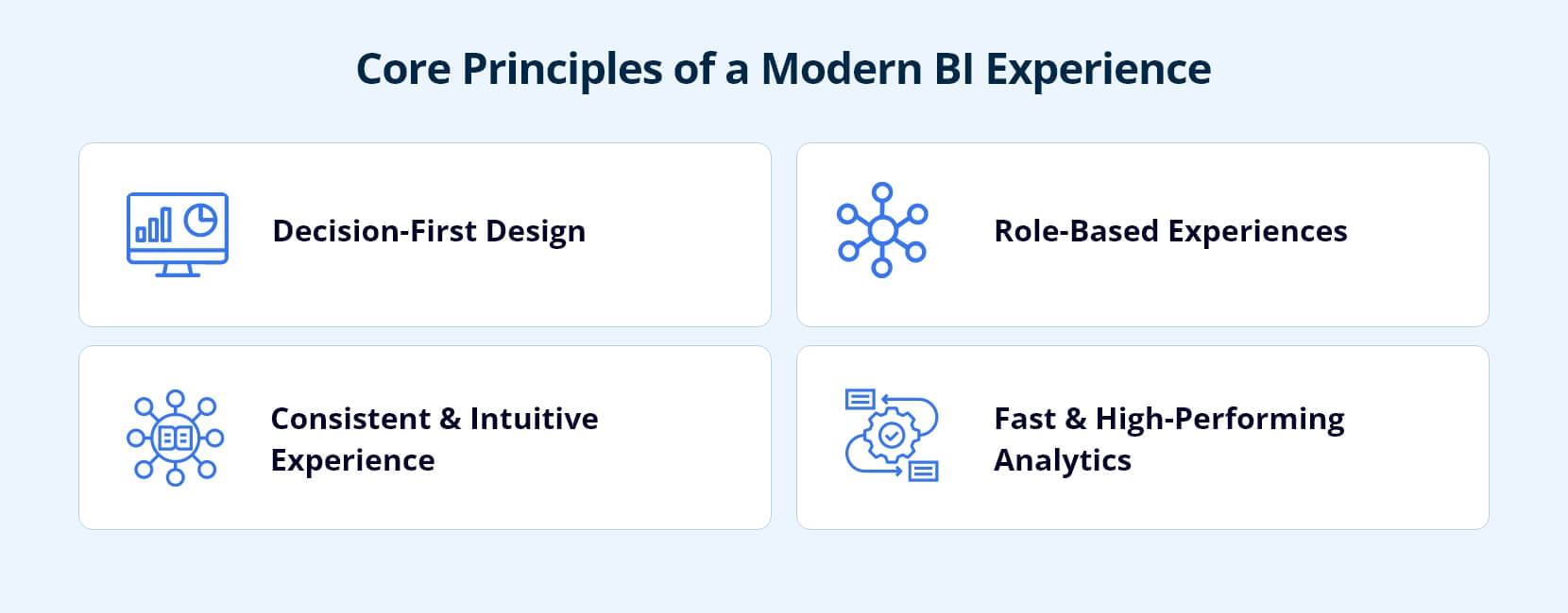
Core Principles Of A Modern BI Experience
If you’re planning analytics modernization, start with experience principles before you worry about tools. These principles keep teams from recreating the same complex dashboards in a new platform.
First, design for a single high-value decision per view. Every main screen should answer one primary question, such as “Where should I focus sales coaching this week?” Supporting charts are welcome, but they all feed that main decision.
Second, keep the visual language consistent across domains. Color, layout, and interaction patterns should feel familiar whether someone is in sales, supply chain, or finance. This consistency shortens learning curves and builds confidence in the system.
Third, prioritize performance. If a page takes more than a few seconds to load, people will default to email threads or offline files, and your data visualization effort will lose credibility fast.
Role-Based Journeys Instead Of One-Size Dashboards
Modern enterprise BI designs around user journeys. A regional manager, a store associate, and an executive sponsor have different questions, tolerance for complexity, and time to spend in a screen.
A practical approach is to map top roles and build a thin experience that solves their most painful use cases first. Then you expand functionality in layers, guided by real feedback rather than assumptions about what “the business” wants.
A Practical Roadmap To Dashboard Modernization
Dashboard modernization works best as a focused program, not a one-off migration. Treat it as a series of releases with clear outcomes, rather than a giant waterfall rebuild of every existing report.
Most teams see success with a phased approach that lets them deliver value early while chipping away at the technical debt in the background.
| Phase | What you do | Output | Exit criteria |
|---|---|---|---|
| 1. Inventory and rationalize | Catalog current reports and sources; score each on usage, complexity, and strategic alignment | A scored inventory and one chosen beachhead domain | You can name which dashboards are unused, and which single domain goes first |
| 2. Redesign journeys | Watch users work; find the skipped steps and the offline trackers they trust more than BI | New journeys targeting a specific measurable outcome | A named cycle-time target exists, e.g. pricing insight from two weeks to two days |
| 3. Build, test, retire | Build on the chosen platform; pilot during a real work week, not in a training sandbox | Live views plus retired legacy equivalents | Usage has stabilized before the old view is switched off |
The exit criterion in phase 3 is the one teams skip. Retiring legacy before adoption stabilizes leaves three competing versions of the truth, which costs more trust than the modernization gains.
Phase 1: Inventory, Rationalize, And Pick A Beachhead
Start with an honest catalog of your current reporting assets and data sources. This is where business intelligence services can help you quickly score dashboards based on usage, complexity, and alignment to strategic goals.
From that list, pick a single domain as your “modern BI beachhead,” such as sales performance or claims operations. Trying to fix everything at once spreads design and engineering capacity so thin that nothing feels finished.
Phase 2: Redesign High-Impact Journeys
Next, sit with users and watch how they actually work. You’ll find steps everyone skips in the official process and a stack of offline trackers they trust more than the BI system.
Use those observations to sketch new journeys that remove hops between systems and target a specific business intelligence modernization outcome, such as reducing time-to-insight for pricing changes from two weeks to two days.
Phase 3: Build, Test, And Retire Legacy
Once you’ve agreed on journeys, design and build new views on your chosen modern BI platform. Release a small pilot group first and insist on live testing during their real work week, not in a training sandbox.
Measure adoption, decision speed, and impact on KPIs. Only after usage stabilizes do you start retiring the corresponding legacy views, which helps avoid having three competing versions of “the truth.” Where the move also means changing tools, analytics migration and Power BI migration handle the conversion work.
Technology Choices For Analytics Modernization
No tool alone will fix a broken BI culture, but the right architecture can reduce friction. Analytics modernization usually involves both the semantic layer and the presentation layer, and you need them to work in concert.
For many enterprises, this means standardizing on a governed, reusable data layer with clear definitions, then exposing it through a modern exploration and dashboard tool that business users can actually drive. Why that layer is the load-bearing part is set out in why a semantic layer finally makes enterprise AI trustworthy.
Think in terms of “minimum viable stack” rather than every feature a vendor demo shows. Start by confirming that your stack supports row-level security, flexible data modeling, and easy sharing of curated content.
From there, focus your configuration effort on things that directly shape the user experience, like certified datasets, reusable templates, and governed metrics. Natural-language access is the next layer up, and conversational analytics only works where those governed metrics already exist.
When To Bring In BI Consulting Expertise
Many internal teams can manage the technology rollout, but they struggle with design and change management. That’s where specialized BI consulting partners often pay for themselves quickly.
External experts bring pattern libraries, proven design standards, and facilitation skills that keep workshops moving. They can also serve as neutral voices when different business units disagree about definitions or ownership.
Use consultants for the high-value parts of business intelligence modernization: experience blueprints, data model patterns, and adoption plays. Keep domain-specific logic and long-term operations in-house so you don’t become dependent on a third party.
Measuring The Impact Of BI Transformation
For BI transformation to stick, you need more than anecdotal praise from a few power users. Define specific metrics that prove the new experience is actually changing behavior and results.
Adoption metrics matter, but they’re not enough. Track cycle times for recurring decisions, such as “time from campaign performance review to budget reallocation,” and compare them before and after your rollout.
Many organizations also track reduction in shadow systems and manual work. For example, teams aim to cut the number of offline trackers or monthly slide decks by half within six months of releasing modern BI views. Those measures sit alongside the wider set in 12 KPIs for measuring AI ROI.
Those concrete deltas do more to keep sponsorship and funding than any internal marketing campaign.
Building A Culture Around Modern BI
A successful enterprise BI program treats data literacy and behavior change as core work, not side projects. Training isn’t a single workshop; it’s a series of small, context-specific moments. A data fluency assessment is a practical way to find out where your teams actually stand before designing that programme.
Pair release notes with quick “how I use this screen” recordings from respected leaders. Recognize teams that retire manual reports. Bake data review into existing rituals so people use the BI system in real-time conversations, not just after the fact.
Where Infocepts Fits
Infocepts treats BI as product design and adoption work rather than a report-rebuilding exercise, with the governed semantic layer built before the front end that depends on it.
- Rated #1 Data & Analytics provider on Gartner Peer Insights, three years running, with 97.2% client retention across 20+ years of delivery.
- Named services for each phase above — data product design, enterprise reporting, and analytics migration.
- Migration tooling through FLASH, so converting legacy report estates starts from accelerators rather than a manual rebuild.
The Bottom Line
Replacing legacy dashboards with decision-ready analytics takes more than a new tool. It takes a clear view of the decisions that matter, strong experience design, and a self service BI culture that rewards users for working in the new way.
If you focus on real user journeys, phase your modernization, and measure behavior change, you can leave static reports behind and build an analytics ecosystem that actually guides decisions. Start by choosing one critical domain to reimagine first.
Frequently Asked Questions
Replace Static Dashboards With Decisions
Phased BI modernization built on real user journeys and a governed semantic layer - fewer dashboards, named owners, and legacy retired only once adoption holds.
Recent Blogs



Infocepts