
A loyalty program can look completely healthy on paper.
Gold membership holds steady. Silver continues to grow. Revenue remains predictable. Every dashboard suggests the loyalty program is performing exactly as expected.
But a stable Gold count can hide two completely different realities. Either customers are consistently retaining their status, or customers are leaving Gold as quickly as new members qualify for it. Traditional loyalty reporting cannot tell the difference. It shows who is in a tier today, but not how they got there, who moved up, who moved down, or who quietly exited.
That blind spot is what we call the Gold Tier Illusion — and it’s precisely the challenge a global footwear and apparel brand encountered while managing a loyalty program with more than 30 million members across multiple markets.
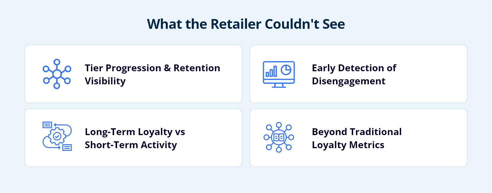
What The Retailer Couldn’t See
Like many retailers, the organization had strong visibility into standard loyalty metrics: members by tier, new enrollments, loyalty-generated revenue, active member counts.
Useful numbers, but they couldn’t answer the questions that actually determine program health:
- How many members were progressing into higher-value tiers versus churning out of them?
- Were Gold members retaining their status year over year?
- Which segments were showing early signs of disengagement?
- Were promotions creating long-term loyalty or simply driving short-term qualification activity?
The gap wasn’t a lack of data. It was that the reporting model measured current-state membership rather than customer movement over time. Leadership could see the destination, but not the journey.
Population Vs. Movement: The Same Ending, Very Different Stories
Consider two loyalty programs that both finish the quarter with the same number of Gold members.
| Movement Type | Program A | Program B |
|---|---|---|
| Silver → Gold | 10,000 | 40,000 |
| Gold → Silver | 9,500 | 39,500 |
| Existing Gold Retained | 80,000 | 50,000 |
At first glance, both programs look equally healthy. Their underlying dynamics are not. Program A is driven by retention. Most Gold members stay Gold, creating a stable base of high-value customers. Program B is driven by replacement. Large numbers leave Gold while an equally large number enter, creating the appearance of stability on top of much weaker retention.
A traditional dashboard treats these two programs as identical. Migration analysis shows they’re fundamentally different — and that difference determines whether a loyalty program is compounding customer value or simply churning in place.
Building A Migration View Of Customer Behavior
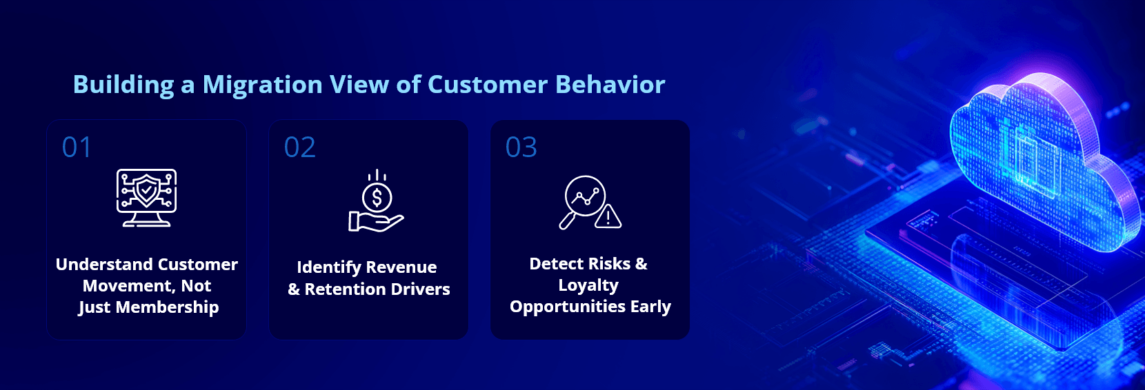
To close this gap, the retailer moved beyond point-in-time snapshots and began tracking how members transitioned between tiers over time, including upgrades, downgrades, retention, and re-entry patterns. Instead of focusing exclusively on where each customer sat today, the business gained visibility into how customer relationships evolved over time — the same shift behind customer behaviour mapping and integrated CRM intelligence for a global fashion retailer.
That historical view quickly uncovered insights that traditional reporting never could:
Revenue concentration. Nearly 70% of loyalty revenue was concentrated within just two loyalty tiers, helping leadership pinpoint where retention investments, personalization efforts, and engagement programs would have the greatest business impact.
Retention visibility. For the first time, teams could measure true tier retention rather than inferring loyalty health from stable-looking membership counts — creating a far more accurate picture of customer engagement and program effectiveness.
Promotion effectiveness. Campaigns could now be evaluated based on whether they created sustained tier progression and long-term engagement, not merely short-term purchase spikes — distinguishing promotions that built lasting loyalty from those that generated temporary qualification activity followed by decline.
Early warning signals. Migration patterns revealed customers gradually trending toward a downgrade months before the impact surfaced in revenue, giving loyalty teams the chance to protect high-value relationships before churn became visible.
Scaling Historical Loyalty Insights Across 30 Million Members
Tracking loyalty movement across more than 30 million members over multiple years creates a significant analytical challenge. Most members remain within the same tier for extended periods, so capturing and storing identical records for every reporting cycle would generate enormous volumes of repetitive data while delivering little additional business value.
Instead, the retailer adopted a historical tracking approach that recorded changes only when a member’s tier status actually changed, preserving every meaningful transition while dramatically reducing unnecessary duplication. The result was an approximate 97% reduction in reporting data volume, along with faster dashboard performance and improved business self-service — making long-term customer movement analysis practical at enterprise scale rather than merely theoretical.
Where Infocepts Fits
Infocepts builds loyalty analytics as a migration view of customer behavior, not a point-in-time count of who sits where today.
- Rated #1 Data & Analytics provider on Gartner Peer Insights, three years running, with 97.2% client retention across 20+ years of delivery.
- Platform-native at loyalty scale — this migration model runs on Databricks and Snowflake, the same platforms behind a 97% cut in reporting data volume at 30 million members.
- Proven on customer intelligence for retail specifically, including integrated CRM intelligence for a global fashion retailer and omnichannel customer intelligence across physical and digital touchpoints.
The Takeaway For Retail Leaders
Member counts and tier distributions remain important metrics, but by themselves, they only tell part of the story. A stable Gold tier can represent strong customer retention, or it can conceal significant churn. A growing Silver tier can indicate healthy customer progression, or it can expose a loyalty funnel that struggles to convert members into high-value relationships. Traditional snapshot reporting cannot tell you which scenario you’re facing. Migration analytics can.
For this global footwear and apparel brand, that shift turned loyalty reporting from a static count of members into a dynamic view of customer behavior — revealing where revenue, retention, growth, and risk truly existed. The most important question was no longer how many customers sat in Gold today, but whether more customers were moving toward Gold than away from it. Because loyalty isn’t defined by where customers are. It’s defined by where they’re going.
If your loyalty dashboards can tell you where members are today but not how they got there, that’s the gap worth closing first — and it’s usually a faster fix than it looks.
Frequently Asked Questions
See What Your Loyalty Program Is Actually Doing
Move from point-in-time tier counts to a migration view of customer behavior - retention, downgrades, and early churn signals, months before they show up in revenue.

Author
The Infocepts Retail COE brings together data and analytics specialists focused on helping retail and CPG organizations turn complex data into smarter decisions. From demand forecasting and inventory optimization to customer analytics and omnichannel performance, the team works at the intersection of data engineering, AI, and retail strategy.
Read Full BioRecent Blogs



Infocepts